캐글 [자거거 수요량 예측] 경진대회 도전!!!

캐글 노트북은 아래 링크에서 확인 할 수 있습니다.
https://www.kaggle.com/code/rickyhouse/bike-sharing-demand-randomforest
[Bike Sharing Demand | RandomForest
Explore and run machine learning code with Kaggle Notebooks | Using data from Bike Sharing Demand
www.kaggle.com](https://www.kaggle.com/code/rickyhouse/bike-sharing-demand-randomforest)
EDA(탐색적 데이터 분석)
Description
datetime - hourly date + timestamp
season - 1 = spring, 2 = summer, 3 = fall, 4 = winter
holiday - whether the day is considered a holiday
workingday - whether the day is neither a weekend nor holiday
weather
1: Clear, Few clouds, Partly cloudy, Partly cloudy
2: Mist + Cloudy, Mist + Broken clouds, Mist + Few clouds, Mist
3: Light Snow, Light Rain + Thunderstorm + Scattered clouds, Light Rain + Scattered clouds
4: Heavy Rain + Ice Pallets + Thunderstorm + Mist, Snow + Fog
temp - temperature in Celsius
atemp - "feels like" temperature in Celsius
humidity - relative humidity
windspeed - wind speed
casual - number of non-registered user rentals initiated
registered - number of registered user rentals initiated
count - number of total rentals
- 대여량에 대한 데이터가 있기 때문에 지도학습(Supervised Learning)에 해당
- 자건거 대여량을 예측하는 문제이기 때문에 분류와 회귀 중 회귀와 관련 됨.
* 칼럼 및 데이터 타입 확인
# train.columns
# train.dtypes
train.info()
<class 'pandas.core.frame.DataFrame'>
RangeIndex: 10886 entries, 0 to 10885
Data columns (total 12 columns):
# Column Non-Null Count Dtype
--- ------ -------------- -----
0 datetime 10886 non-null datetime64[ns]
1 season 10886 non-null int64
2 holiday 10886 non-null int64
3 workingday 10886 non-null int64
4 weather 10886 non-null int64
5 temp 10886 non-null float64
6 atemp 10886 non-null float64
7 humidity 10886 non-null int64
8 windspeed 10886 non-null float64
9 casual 10886 non-null int64
10 registered 10886 non-null int64
11 count 10886 non-null int64
dtypes: datetime64[ns](1), float64(3), int64(8)
memory usage: 1020.7 KB
* 상위 5개 데이터 확인
train.head()
* 결측치 확인 : null인 데이터는 없음
train.isnull().sum()datetime 0
season 0
holiday 0
workingday 0
weather 0
temp 0
atemp 0
humidity 0
windspeed 0
casual 0
registered 0
count 0
dtype: int64
* 시각화해서 보기 편하도록 train 데이터의 'datatime' 칼럼을 년, 월, 일, 시, 분, 초로 나눠서 보자
칼럼이 12개에서 18개로 늘어난 것을 볼 수있다
train["year"] = train["datetime"].dt.year
train["month"] = train["datetime"].dt.month
train["day"] = train["datetime"].dt.day
train["hour"] = train["datetime"].dt.hour
train["minute"] = train["datetime"].dt.minute
train["second"] = train["datetime"].dt.second
train.shape
(10886, 18)
* 년, 월, 일, 시, 분, 초별로 대여량 시각화 해보기
figure, ((ax1,ax2,ax3), (ax4,ax5,ax6)) = plt.subplots(nrows=2, ncols=3)
figure.set_size_inches(18,8)

sns.barplot(data=train, x="year", y="count", ax=ax1)
sns.barplot(data=train, x="month", y="count", ax=ax2)
sns.barplot(data=train, x="day", y="count", ax=ax3)
sns.barplot(data=train, x="hour", y="count", ax=ax4)
sns.barplot(data=train, x="minute", y="count", ax=ax5)
sns.barplot(data=train, x="second", y="count", ax=ax6)

ax1.set(ylabel='Count',title="Rental volume by year")
ax2.set(xlabel='month',title="Rental volume by month")
ax3.set(xlabel='day', title="Rental volume by day")
ax4.set(xlabel='hour', title="Rental volume by houre")
- year : 2011년 보다 2012년애 대여량이 더 많다.
- month : 6월에 대여량이 가장 많다. 7~10월도 대여량이 많다. 그리고 1월에 가장 적다.
- day : 1일부터 19일까지만 있고 나머지 날짜는 test.csv에 있다. 그래서 이 데이터는 피처로 사용하면 안 된다.
- hour : 출퇴근 시간에 대여량이 많은 것 같다. 하지만 주말과 나누어 볼 필요가 있을 것 같다.
- 분, 초는 모두 0이기 때문에 의미가 없다.
* 계절, 시간, 근무일 여부에 따른 대여량 시각화 해보기
fig, axes = plt.subplots(nrows=2,ncols=2)
fig.set_size_inches(12, 10)
sns.boxplot(data=train,y="count",orient="v",ax=axes[0][0])
sns.boxplot(data=train,y="count",x="season",orient="v",ax=axes[0][1])
sns.boxplot(data=train,y="count",x="hour",orient="v",ax=axes[1][0])
sns.boxplot(data=train,y="count",x="workingday",orient="v",ax=axes[1][1])

axes[0][0].set(ylabel='Count',title="Rental volume")
axes[0][1].set(xlabel='Season', ylabel='Count',title="Rental volume by seaon")
axes[1][0].set(xlabel='Hour Of The Day', ylabel='Count',title="Rental volume by houre")
axes[1][1].set(xlabel='Working Day', ylabel='Count',title="Rental volume by working day")
- 대여량은 특정 구간에 몰려 있음
- 계절별 대여량은 가을이 가장 많고, 여름, 겨울, 봄 순으로 대여량이 많다.
- 시간별 대여량은 출퇴근 시간에 많다.
- 휴일에 대여량이 조금 더 많은것 같지만, 큰 차이는 없는 것으로 보인다.
* 'dayofweek' 칼럼 train 데이터에 추가
train["dayofweek"] = train["datetime"].dt.dayofweek
train.shape
* 시간대별 시각화해서 보기
fig,(ax1,ax2,ax3,ax4,ax5)= plt.subplots(nrows=5)
fig.set_size_inches(18,25)

sns.pointplot(data=train, x="hour", y="count", ax=ax1)

sns.pointplot(data=train, x="hour", y="count", hue="workingday", ax=ax2)

sns.pointplot(data=train, x="hour", y="count", hue="dayofweek", ax=ax3)

sns.pointplot(data=train, x="hour", y="count", hue="weather", ax=ax4)

sns.pointplot(data=train, x="hour", y="count", hue="season", ax=ax5)
- 시간대별 그래프를 봤을 때 출퇴근 시간에 대여량이 많은 것으로 보인다.
- workingday를 기준으로 보면 출퇴근 시간에만 대여량이 많은 것인 아니다. 휴일일 때는 11시부터 5시까지 대여량이 많다.
- 요일별로 봤을 때도 workingday를 기준의 그래프와 흡사한 결과를 보여줌
- 날씨를 기준으로 보면 날씨가 좋을 때 많이 빌린다.
- 계절별로 봤을때 가울, 여름, 겨울, 봄 순으로 대여량이 많다.
* 온도, 등록된 사용자인지, 습도, 풍속이 어떤 연관관계가 있는지 확인
corrMatt = train[["temp", "atemp", "casual", "registered", "humidity", "windspeed", "count"]]
corrMatt = corrMatt.corr()
print(corrMatt)

mask = np.array(corrMatt)
mask[np.tril_indices_from(mask)] = False
fig, ax = plt.subplots()
fig.set_size_inches(20,10)
sns.heatmap(corrMatt, mask=mask,vmax=.8, square=True,annot=True)
- 온도, 습도, 풍속은 거의 연관관계가 없다.
- 대여량과 가장 연관이 높은 건 registered 로 등록 된 대여자가 많지만, test 데이터에는 이 값이 없다. 피처로 사용하기 어렵다.
- atemp와 temp는 0.98로 상관관계가 높지만 온도와 체감온도로 피처로 사용하기에 적합하지 않을 수 있다.
* 온도, 풍속, 습도에 따른 산점도 확인
fig,(ax1,ax2,ax3) = plt.subplots(ncols=3)
fig.set_size_inches(12, 5)
sns.regplot(x="temp", y="count", data=train,ax=ax1)
sns.regplot(x="windspeed", y="count", data=train,ax=ax2)
sns.regplot(x="humidity", y="count", data=train,ax=ax3)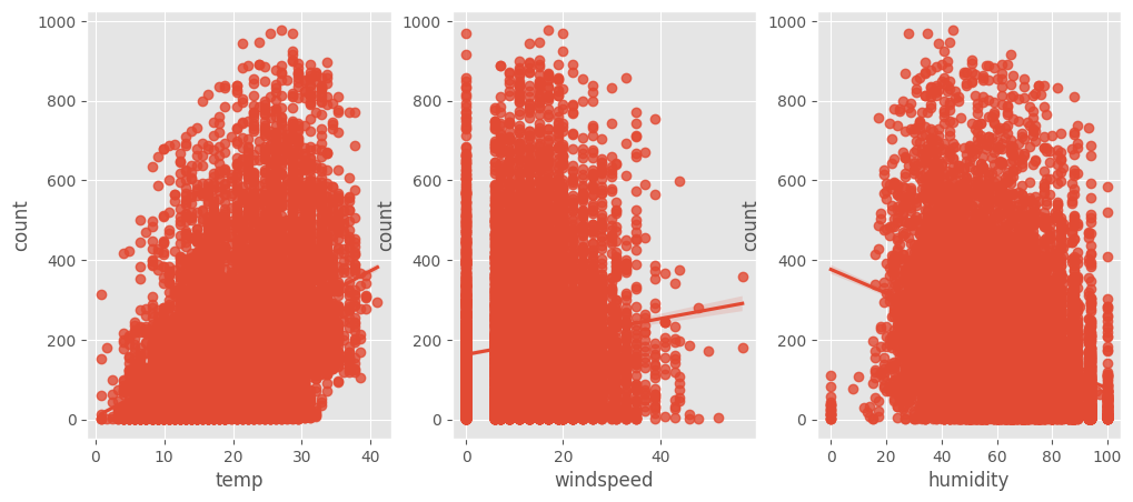
- 풍속은 0에 데이터가 몰려있는 것으로 보여진다.
- 습도도 0, 100에 일부 데이터가 몰려있다.
* 년과 월을 붙여서 월별 데이터 살펴보기
def concatenate_year_month(datetime):
    return "{0}-{1}".format(datetime.year, datetime.month)

train["year_month"] = train["datetime"].apply(concatenate_year_month)

print(train.shape)
train[["datetime", "year_month"]].head()
fig, (ax1, ax2) = plt.subplots(nrows=1, ncols=2)
fig.set_size_inches(18, 4)
sns.barplot(data=train, x="year", y="count", ax=ax1)
sns.barplot(data=train, x="month", y="count", ax=ax2)
fig, ax3 = plt.subplots(nrows=1, ncols=1)
fig.set_size_inches(18, 4)
sns.barplot(data=train, x="year_month", y="count", ax=ax3)

- 2011년 대비 2012년 대여량이 늘어남
- 1월부터 대여량이 늘어나 11월부터 줄어든다. 날씨가 따뜻할 때 대여량이 많은 것으로 보인다.
- 2011년과 2012년 월별 데이터를 이어보면 전체적으로 대여량이 증가하는 추세다.
- 2011년 1월과 2012년 2월을 비교해도 거의 대여량이 거의 2배 가량 늘어난 것으로 보인다.
* 아웃라라이어 데이터 제거하기
아웃라이어(outlier)는 원래 통계학 용어로 정상적인 분포를 벗어나 홀로 따로 떨어진 데이터
# trainWithoutOutliers
trainWithoutOutliers = train[np.abs(train["count"] - train["count"].mean()) <= (3*train["count"].std())]

print(train.shape)
print(trainWithoutOutliers.shape)
(10886, 20)
(10739, 20)- 0에 몰려 있는 데이터와 너무 끝에 있는 데이터를 제외하 10886개에서 10739개로 데이터가 줄어든다.
* 기존데이터와 아웃라라이어 제거한 데이터 분포 그래프로 확인
# count값의 데이터 분포도를 파악
figure, axes = plt.subplots(ncols=2, nrows=2)
figure.set_size_inches(12, 10)

sns.distplot(train["count"], ax=axes[0][0])
stats.probplot(train["count"], dist='norm', fit=True, plot=axes[0][1])
sns.distplot(np.log(trainWithoutOutliers["count"]), ax=axes[1][0])
stats.probplot(np.log1p(trainWithoutOutliers["count"]), dist='norm', fit=True, plot=axes[1][1])
기존 데이터는 0에 몰려 있던 데이터가 있다.
대부분의 기계학습은 종속변수가 normal 이어야 하기에 정규분포를 갖는 것이 바람직하다.
대안으로 outlier data를 제거하고 "count"변수에 로그를 씌워 변경해 봐도 count변수가 오른쪽에 치우쳐져 있다.
정규분포를 따르지는 않지만 이전 그래프보다는 좀 더 자세히 표현하고 있다.
* 랜덤포레스트로 자전거 수요량 회귀 예측하기
Feature Engineering
train["year"] = train["datetime"].dt.year
train["month"] = train["datetime"].dt.month
train["day"] = train["datetime"].dt.day
train["hour"] = train["datetime"].dt.hour
train["minute"] = train["datetime"].dt.minute
train["second"] = train["datetime"].dt.second
train["dayofweek"] = train["datetime"].dt.dayofweek
train.shape
test["year"] = test["datetime"].dt.year
test["month"] = test["datetime"].dt.month
test["day"] = test["datetime"].dt.day
test["hour"] = test["datetime"].dt.hour
test["minute"] = test["datetime"].dt.minute
test["second"] = test["datetime"].dt.second
test["dayofweek"] = test["datetime"].dt.dayofweek
test.shape
Feature Selection
- 신호와 소음을 구분해야 한다.
- 피처가 많다고 해서 무조건 좋은 성능을 내지 않는다.
- 피처를 하나씩 추가하고 변경해 가면서 성능이 좋지 않은 피처는 제거하도록 한다.
# 연속형 feature와 범주형 feature
# 연속형 feature = ["temp","humidity","windspeed","atemp"]
# 범주형 feature의 type을 category로 변경 해 준다.
categorical_feature_names = ["season","holiday","workingday","weather",
                             "dayofweek","month","year","hour"]

for var in categorical_feature_names:
    train[var] = train[var].astype("category")
    test[var] = test[var].astype("category")
feature_names = ["season", "weather", "temp", "atemp", "humidity", "windspeed",
                 "year", "hour", "dayofweek", "holiday", "workingday"]

feature_names
train데이터로 새로운 행 렬 생성
X_train = train[feature_names]

print(X_train.shape)
X_train.head()
test 데이도 같은 피처로 데이터셋 구성
X_test = test[feature_names]

print(X_test.shape)
X_test.head()
Bike Sharing Demand 평가 방법
RMSLE
과대평가 된 항목보다는 과소평가 된 항목에 패널티를 준다.
오차(Error)를 제곱(Square)해서 평균(Mean)한 값의 제곱근(Root) 으로 값이 작을 수록 정밀도가 높다.
0에 가까운 값이 나올 수록 정밀도가 높은 값이다.

from sklearn.metrics import make_scorer

def rmsle(predicted_values, actual_values):
    # 넘파이로 배열 형태로 바꿔준다.
    predicted_values = np.array(predicted_values)
    actual_values = np.array(actual_values)

    # 예측값과 실제 값에 1을 더하고 로그를 씌워준다.
    # 1을 더하는 이유는 0일때 마이너스 무한대가 되기 때문에 1을 더해주고 로그를 씌운다.
    log_predict = np.log(predicted_values + 1)
    log_actual = np.log(actual_values + 1)

    # 위에서 계산한 예측값에서 실제값을 빼주고 제곱을 해준다.
    difference = log_predict - log_actual
    # difference = (log_predict - log_actual) ** 2
    difference = np.square(difference)

    # 평균을 낸다.
    mean_difference = difference.mean()

    # 다시 루트를 씌운다.
    score = np.sqrt(mean_difference)

    return score

rmsle_scorer = make_scorer(rmsle)
rmsle_scorer
RandomForest로 예측하기
from sklearn.ensemble import RandomForestRegressor

max_depth_list = []

model = RandomForestRegressor(n_estimators=100,
                              n_jobs=-1,
                              random_state=0)
model
- n_estimators 값을 좀더 높이면 좀더 좋은 성능을 내지만, 값을 높일 수록 예측하는데 시간이 많이 걸린다.
%time score = cross_val_score(model, X_train, y_train, cv=k_fold, scoring=rmsle_scorer)
score = score.mean()
# 0에 근접할수록 좋은 데이터
print("Score= {0:.5f}".format(score))
CPU times: user 51.1 s, sys: 555 ms, total: 51.6 s
Wall time: 15.2 s
Score= 0.33087# 학습시킴, 피팅(옷을 맞출 때 사용하는 피팅을 생각함) - 피처와 레이블을 넣어주면 알아서 학습을 함
model.fit(X_train, y_train)# 예측
predictions = model.predict(X_test)
print(predictions.shape)
predictions[0:10]# 예측한 데이터를 시각화 해본다.
fig,(ax1,ax2)= plt.subplots(ncols=2)
fig.set_size_inches(12,5)
sns.distplot(y_train,ax=ax1,bins=50)
ax1.set(title="train")
sns.distplot(predictions,ax=ax2,bins=50)
ax2.set(title="test")
Submit
submission = pd.read_csv("/kaggle/input/bike-sharing-demand/sampleSubmission.csv")
submission

submission["count"] = predictions

print(submission.shape)
submission.head()
- 캐글에서 제공하는 sampleSubmission 파일을 불러와서 "count"에 예측한 값을 넣어준다.
submission.to_csv("Bike Sharing Demand_submit01", index=False)
